Greetings, PS Blog. My name is Ben Fiquet and I’m the CEO of Lizardcube and the Art Director on Streets of Rage 4. It’s been a long journey but we’re finally here: Streets of Rage 4 comes out in a week! Everybody at Lizardcube, Dotemu and Guard Crush Games can’t wait for you to play it and try the various game modes and content we’ve created for this series revival.
For today I’d like to share some insights regarding our redesign of Blaze and Adam, two of the series’ most iconic characters.
Streets of Rage 4 has 17 characters to choose from: 12 retro characters in all their pixel-art glory, and five iconic HD hand-drawn heroes. Blaze Fielding has appeared in every game since the series began, but with vastly different styling from game to game. It was obvious to us that she would be in Streets of Rage 4, but our challenge was how to render her for players in 2020?
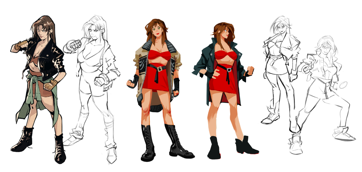
I decided to start from what fans remember most, which is the original sprites. One of her “calling cards” is the color scheme: red, underlined by her miniskirt and tight top. It was important to keep these attributes, as they express not just the character herself but also the fond memories of many players around the globe.
So, I tried different things in my attempt to “get” the character. My point of view is that she’s a strong, independent woman — a cop and a professional dancer who’s not afraid to clean up the streets in a tight skirt.
I liked her jacket in the first episode, which gives her a more urban look, so I wanted to keep it — but in a more modern way.
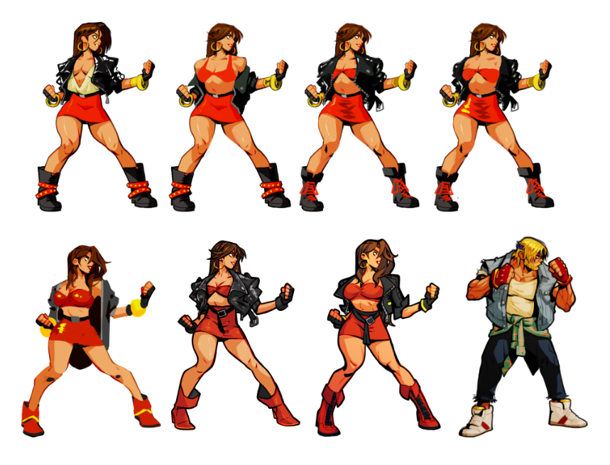
Ultimately, what put me on the right track was returning to her idle pose, which would put her in action and help provide some rhythm to the shapes and contrasts.
The sixth one above is cool, but it’s a bit too aggressive. From all the references I gathered, there’s always something gentle about her face. Also, all the details I included were too complex for animating, which is important in terms of production.
On a side note, as an animator I tend to design knowing that elements will look better when animated. For example: her elaborate belt will make a sweet motion when she moves.
Which brings us to the animation, which is very important to me and is also one of Lizardcube’s strengths.
Due to the technical limitations of the time, the original games didn’t have many frames. To bring the game forward to the present, I wanted as much fluidity and impact as possible. This proved very hard on the production, since each playable Streets of Rage 4 character has approximately 1,000 frames. Plus you have assorted enemies between 300/400 frames each. And everything is hand-drawn frame by frame in Photoshop.
For the special moves, I added more visual effects to increase the impact. This emphasizes that special action and it feels more rewarding to perform. It’s also a continuation of the character – Blaze’s style is more fluid, and using her natural blue FX with some lotus and mandala-type shapes gives her moves their own flavor.
I followed the same mindset when designing Adam. However, because he only appeared in the first episode, there was way less to work with. I tried keeping his shoulder pads, but to no avail — they felt too anchored to the 80s. So I explored other directions… The glasses make him look more mysterious, and sort of remind me of the look of the old sprite, where his eyes are barely noticeable.
Finally, after various attempts to show him wearing a jacket like a PI or a detective, here he is. The same, yet not the same.
Designing Adam
Adam from the first Streets of Rage didn’t have many moves, so we had to iterate what we thought would be a good fit for him. One of his traits is his ability to dash, and the color green for his visual effects was a good choice that sets him apart. I tried to make him snappy with strength, and since Axel has a dragon for a defensive move, I thought the wolf was on point.
Lastly, for Adam’s Ultra move we wanted a wave moving forward. I thought having swords coming out of the ground was kind of new, but would also portray him as a “sword of justice.”
Thanks for reading! I hope you like the game, and that long-time fans will enjoy seeing our new takes on old favorites. Don’t forget you can choose to play their new forms or go retro, just like back in the day.


