Virtual reality finally has a place to call home within Steam. The new SteamVR 2.0 update finally gets rid of the mishmash of menus, styles, and widgets that plagued the original version, and replaces them with a fully featured Steam Lite interface. This new VR version of Steam is easier to navigate, better integrated into the modern Steam app, and actually puts virtual reality games front and centre while you’re wearing a headset. About time, too.
Prior to giving the new SteamVR 2.0 update a bash for myself within the Quest 2, I started with the latest full release, SteamVR 1.27. You have to know where we’ve come from to appreciate what’s new with 2.0. To say Valve has left SteamVR to gather dust isn’t true: bug fixes are a pretty regular occurrence for SteamVR. Version 1.27 only released on September 6 of this year.
Though there’s no denying that Steam’s VR interface is outdated. The app looks over a half-decade old. Library menus are partially ripped from a Big Picture mode that no longer exists within the desktop app. The Store page doesn’t display images correctly and does absolutely nothing to sell my on any of the popular games it lists on the homepage.
You’re better off removing your VR headset and navigating the Steam storefront via the boring old 2D desktop app than sticking with this.
SteamVR hasn’t been the best advertisement for PC VR, either. You spend all this money on a high-end tethered headset and you’re pretty much stuck using Steam’s outdated interface to experience it. Even compared to the budget Quest 2’s homepage, which offers access to the Meta store, game library, and device settings, Valve’s interface is quite rubbish.
SteamVR 1.27 screenshots
The outgoing SteamVR library screen. (Image credit: Valve)
The outgoing SteamVR recently played shortcuts. (Image credit: Valve)
The outgoing SteamVR storefront, which really is awful. (Image credit: Valve)
Thankfully, we’ve now a glimpse of how much better things can be. Valve has released SteamVR 2.0 in beta—the current version is 2.0.2—and it makes for stark comparison to the SteamVR we’re used to.
From jumping around the menus to swiftly accessing your PC’s desktop, all the shortcuts are up front and accessible with SteamVR 2.0. Valve says its goal is to integrate the full remit of the Steam app into the virtual reality version, and I can see where it’s going with that already. Friends, screenshots, and downloads are just a couple button presses away in SteamVR 2.0.
SteamVR 2.0 screenshots
(Image credit: Valve)
(Image credit: Valve)
(Image credit: Valve)
(Image credit: Valve)
(Image credit: Valve)
(Image credit: Valve)
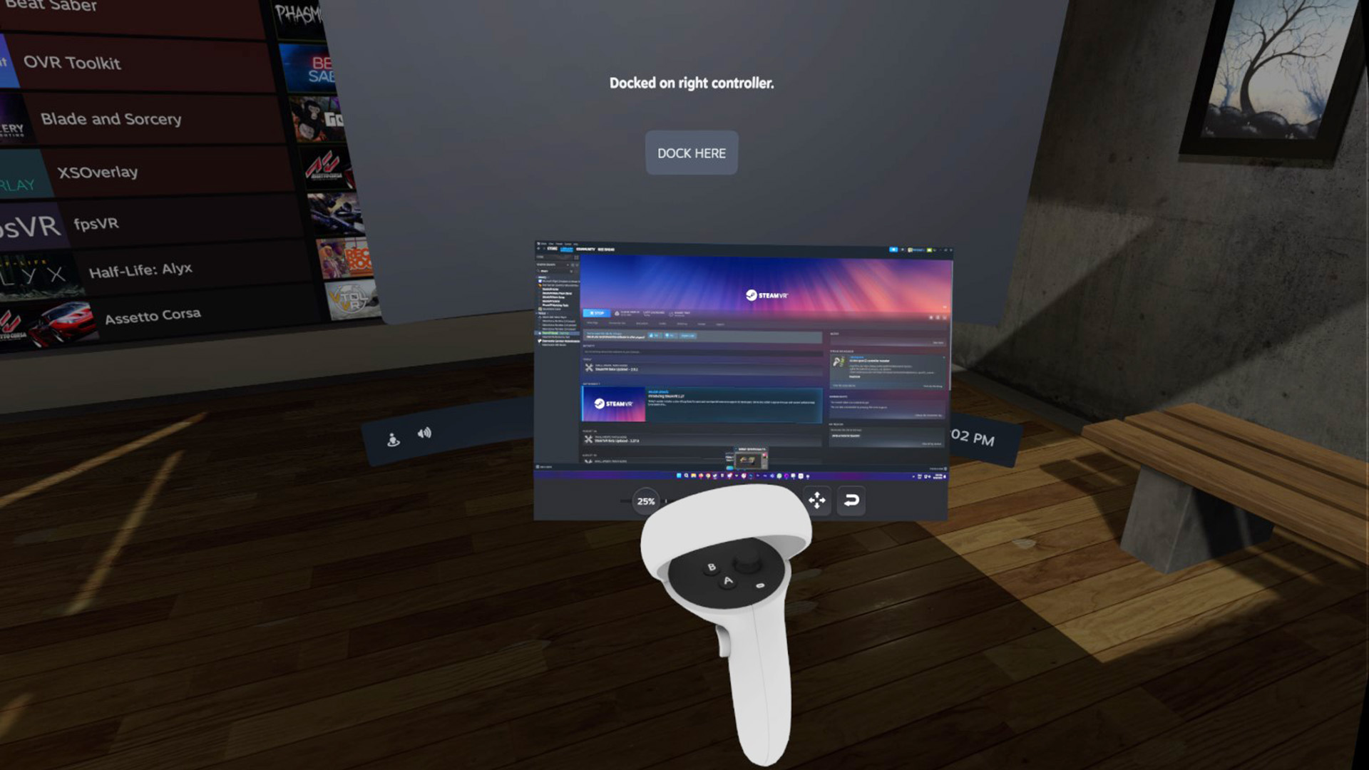
Your desktop monitor (or monitors, in my case) are also a click away from the SteamVR taskbar. These screens can be locked in place in the world or onto your controllers, in case you want to keep a how-to guide close at hand (literally).
If you’ve used the Steam Deck at all, SteamVR 2.0 shares a lot with the version of Steam adopted by SteamOS and latterly the newer Big Picture Mode. The library page is essentially a match for the handheld’s, presenting every game with bright, vertical covers and separating them into handy collections. In SteamVR, there’s the specially-made VR collection with every VR-compatible game in your library already listed. Both the non-Steam and Installed collections make for quick booting of installed games and apps, too.
One more similarity with the Steam Deck is the new keyboard functionality. A new keyboard to match the Steam Deck’s is now in virtual reality.
That new keyboard looks good in VR. (Image credit: Valve)
Though it’s the new storefront that makes the biggest difference to the overall experience. Whereas I’d almost never recommend shopping for new games within VR on older versions of the SteamVR interface, you absolutely could now. A new VR tab neatly organises all those games you’re most likely interested in playing within your headset, and there’s a new banner ad for the biggest VR games of the moment. Admittedly these games are all a couple years old by now, but one day we’ll have a new flagship VR title, I’m sure.
The latest SteamVR update achieves one thing very well: it lets you keep your headset on. I wasn’t doing the awkward dance of removing and replacing my headset as often as I was on the older version, as all my chat notifications and apps are all right there. I can even check if that screenshot actually came out alright from inside VR.
The new storefront. (Image credit: Valve)
(Image credit: Valve)
Best VR headset: which kit should you choose?
Best graphics card: you need serious GPU power for VR
Best gaming laptop: don’t get tied to your desktop in VR
There are a few things that haven’t changed with SteamVR 2.0, or haven’t changed yet. The Home environments are the same, and the settings menu is pretty familiar, too.
This is a beta release nonetheless, and Valve says more updates are coming. There are still bugs and I’ve heard of at least one strange behaviour when trying to close down the app. Valve will surely have this all figured out when this app gets the final go-ahead, maybe when it has some shiny new hardware to go with it—maybe, just maybe. It all seems a little suspiciously timed on Valve’s behalf: rumours of a new headset swirling and SteamVR 2.0 turns up just like that.
From the initial beta release, anyways, there’s no denying SteamVR 2.0 is a huge improvement over what came before. It actually feels like the VR experience you’d expect of Steam in 2023.


