Starfield modder m8r98a4f2 was among the early heroes for Bethesda’s space-em-up, with a mod called StarUI Inventory that tackles one of the game’s biggest pain points. Star UI turns your unwieldy bags of stuff into a lovely clean list that can be sorted by type, weight, and value: which may not sound like much, but will save you enormous amounts of time faffing with the default option trying to find things.
Having tackled that nightmare, m8r98a4f2 is back to tackle another headache: well, a whole bunch of ’em. The grand sequel to their feat is StarUI HUD, which overhauls the existing UI and gives you control over HUD widgets, an updated loot list, and improved item cards with stats like DPS and the value/weight ratio.
This is again an area where the default experience leaves much to be desired, and StarUI HUD goes above-and-beyond in changing things. HUD widgets can be resized, moved around, rotated, colored, or disabled entirely. It also adds a new widget called “Tag Label” that displays the item name and tag icon below your crosshair, meaning you don’t need to look at the big item cards (which move to the top right but can be resized or removed as you see fit). It even auto-filters trash items and displays them slightly faded out, so they don’t draw unnecessary attention. Basically everything about this mod is removing UI clutter and letting you get on with the game.
Another optional added widget is the winningly named “Loot-O-Meter” which displays a bar below your crosshair that fills with the value/weight ratio of a given item, allowing you to easily maximise the value of what you’re carrying. How this displays is also customisable, and it goes along with an upgraded loot list for quickly sorting through containers (which can be resized for more or less items in the view).
These go alongside an absolute slew of minor tweaks to how the game presents information, with the watchword being ease of use: being able to tell what you’re looking at and whether you might want it in a glance. It adds information in places you want it, like item tag icons that easily show a given type, and adds display options such as additional configurable columns to help sort your loot list.
This even gets into the game’s mechanics, and no more shalt thou steal: well, you won’t do it without meaning to. “Accidental steal protection” changes the button for stealing so you need to hold down the E key rather than tapping it to steal, useful because we’ve all done it, on top of which it adds red coloration to the various widgets so you know for sure when stealing is stealing. There’s also a “take all” function added for containers, a whole bunch of new crosshair options, which the mod’s creator understandably gets a little excited about: “Want a big red pistol crosshair, but a small green rifle? You can do it!”
Finally there’s a bunch of watch customisation settings, with four preset options available, tweaks to how buttons are displayed, and amazingly useful yet tiny additions, such as showing a big door icon on doors which will transport you to other areas via a loading screen.
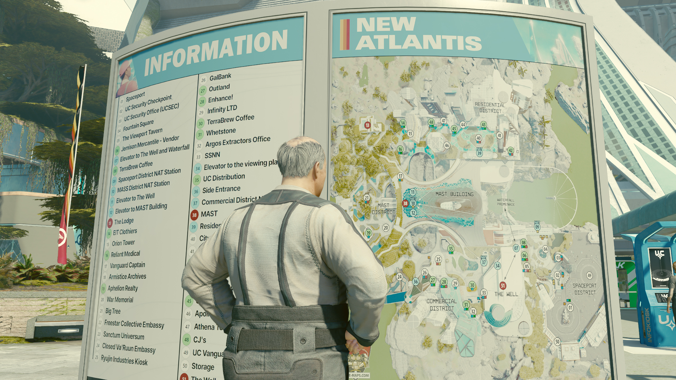
It’s a shame StarUI is even necessary, but it is. Starfield may get a lot of things right but the UI and inventory generally are not among them, and often feel like they’re getting in the way of your cosmic quest rather than helping them. PCG’s Chris Livingston, who liked the game well enough in his Starfield review, found himself constantly annoyed by its failings here: “The inventory system is truly rotten, frustrating in a game where you’re collecting anything and everything and trying to shuffle items between your companion, your ship’s inventory, your storage crates at your base, and your own pockets.”


