Paint now offers the single-most useful feature I require of a photo editing application: background removal. And before you turn your nose up at little ol’ Paint, let me tell you this: it’s really rather great.
As a long-time Adobe Photoshop user, I’m often on my high horse about how good Photoshop’s background removal tools are. The company, which strives to be the first and only word in AI photo editing, is often integrating new AI-powered features into its photo editing software, though it also charges a significant monthly sum for the privilege of using it. Nonetheless, I often use these features daily with few complaints.
Then there’s Paint. An application that six years ago appeared destined for the recycle bin, only to be saved by an “outpouring of support and nostalgia”. An application that has sat within the Windows OS for over three decades and barely changed an iota for many of those years. At least until very recently.
In a recent Insider build of Windows 11, Microsoft dropped a new background removal feature into the long in the tooth, often neglected, app.
For admittedly snobbish reasons, I didn’t have particularly high expectations of Paint’s native background removal feature. But I was editing an image of a Samsung monitor for a recent article and, actually, Photoshop’s new-fangled AI background removal proved too smart for its own good.
Photoshop’s tool saw the spaceship adoring the stock image of Samsung’s monitor as the subject of the image, not the monitor itself, and made a right mess of the whole thing. My colleague then suggested I should see if Paint’s new background removal tool makes the same mistake.
Lo and behold, no, it doesn’t. Paint makes a clean cut around the monitor and delivers the desired result.
That’s one example, and admittedly it’s not an issue I’ve run into all that often on PS, but this result was clearly cause for some further experimentation to compare the two tools.
Here I’ve picked another image that I took within a lightbox of the Ayaneo Air 1S. Not a tricky image to cut out, but a good test case to see how this goes. In both apps, all I’m doing is hitting the remove background button and adding a brightly coloured background for clarity. Here are the results:
The Photoshop cut is certainly cleaner. Paint appears to make more of a mess of straight edges. Paint did, however, manage to cut out the shadow and leave me with a nice clear cutout to place onto another background, whereas Photoshop did not. This still feels like a bit of a win for Photoshop, but it’s really close.
The next image I tried was something more complex. It’s a picture of me on a rooftop in Malaysia. There’s plenty of contrast for an algorithm to cut around thanks to my black t-shirt, though pay close attention to the hair.
Photoshop scores big points here for keeping that thin strand of hair in the final image, and it’ll actually manage to do that even better if you use the cloud version of the Object Selection Tool, but Paint has done a mighty fine job as well. In a pinch, the Paint version would work just great for many purposes—at least in my day-to-day work.
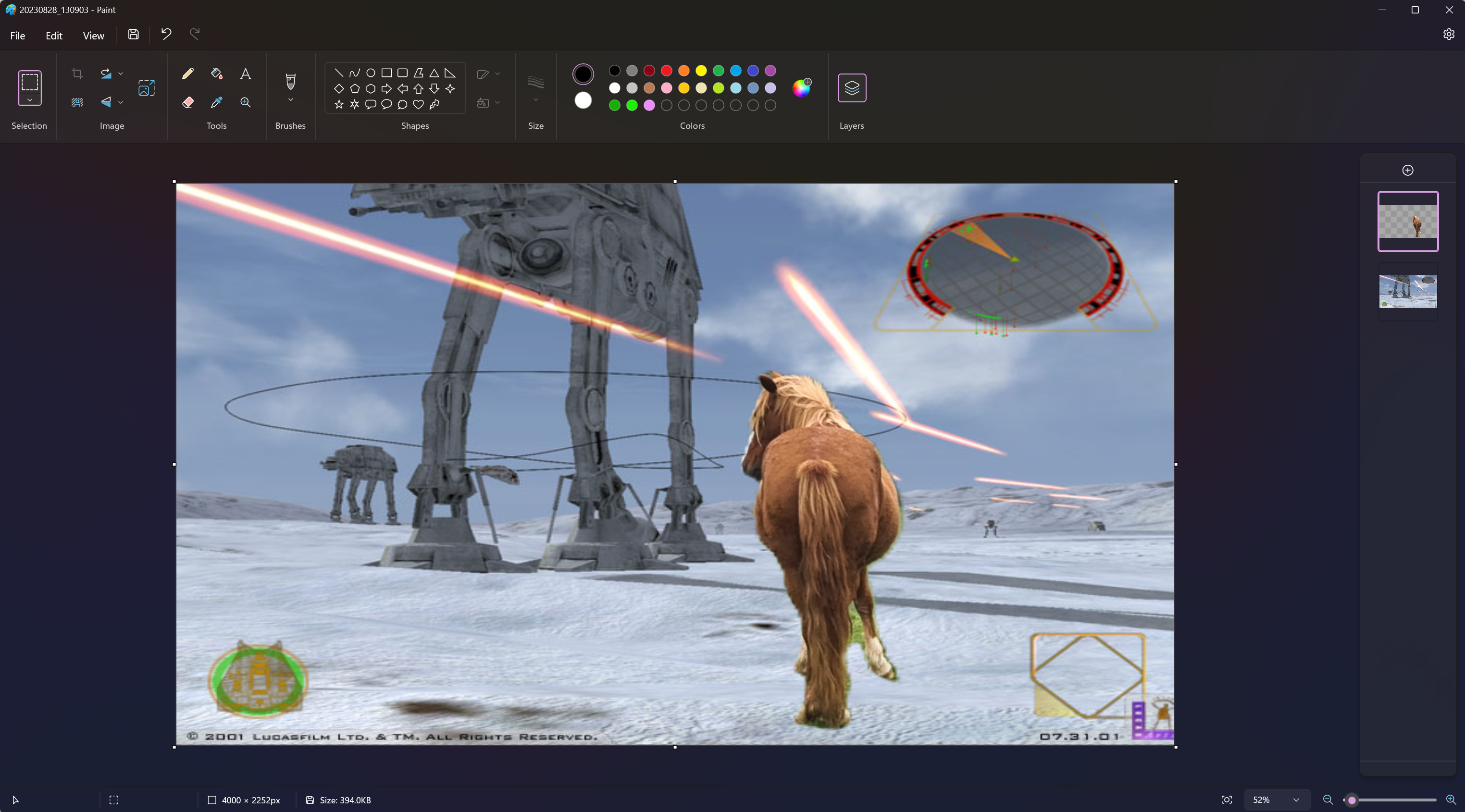
One last one: a picture of a horse I took on a recent hike. Let’s mix things up with a more exciting background.
Again, Photoshop is superior, but I wouldn’t be miffed with the Paint result, either.
The key difference here is that Photoshop costs a lot of money, whereas Paint is completely free. I’m not saying anyone with a professional or even hobbyish interest in photo editing should ditch Photoshop for Paint in the near-future, either. Paint is nowhere close to the fully-featured editor that Photoshop is today. But for anyone looking to just handily cut out an image from a background, a common editing job that Photoshop absolutely excels at, I am seriously vouching for Paint in 2023.
And back when it was destined for the Windows scrapheap, who would have thought we’d be saying such a thing?


