


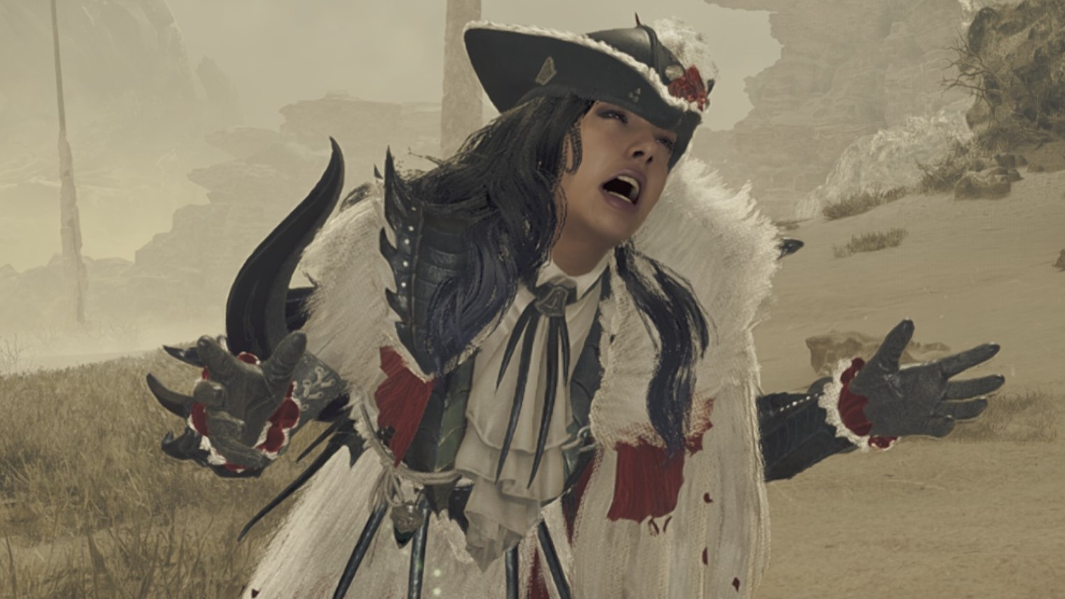
Everyone wants to talk about whether Monster Hunter Wilds is “too hard” or made the series “too streamlined” but I say damn your difficulty discourse. The real difficulty curve in Monster Hunter has nothing to do with whacking big lizards—which is probably going to get harder later anyhow—and has everything to do with its shambling monstrosity of a user interface.
I won’t mince words: Monster Hunter Wilds’ menus are a disaster. They’re convoluted, overlapping, and poorly labeled. While the campaign is essentially a prolonged tutorial for the ins and outs of hunting, the vast web of options and auxiliary systems barely warrant a mention. Did Capcom construct a labyrinth of menus so unnavigable that even its own developers gave up on explaining their way out of it?
The item bag makes me want to scream as I juggle three different button presses in the middle of a monster fight just to use a status effect item. I’ve got to hold the left bumper, press a D-pad direction for a category of quick-use items, and then use my right stick to point at the specific item I actually want.
And that’s the convenient way to use something if I’ve already customized my bag and pinned items to it. Heaven forbid I have to just cycle through my entire bag with X while a Congalala crop dusts me.
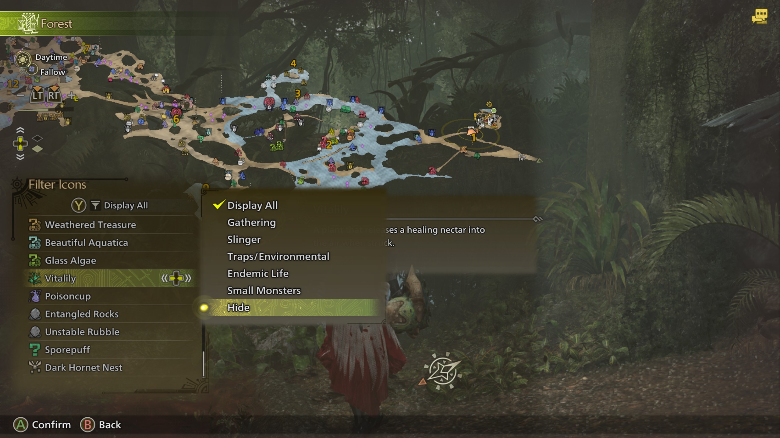
I’m even madder at the map. It’s totally overwhelming by default, with everything from monsters to small creatures to endemic life and resource collection nodes all smashed together in bright colors. “Oh you can filter the map icons,” my friend told me. How? By pressing a button on the map menu that is not labeled at all (the D-pad, again) and finding it in a submenu.
Even once I get into the map filter options, there’s no way to filter out everything extraneous and only view main huntable monsters on the map. Oh but wait, yes there is! It’s by opening the filter menu and choosing “hide” which of course means hiding everything other than the monsters, which is definitely how I should have interpreted that.
I haven’t even tried to figure out how Monster Hunter Wilds’ layered armor system works. Can I not choose a pigment for my armor because I’ve not unlocked the system yet or because I just haven’t figured out which option in the sub menu controls it? Truly, I do not know.
The photo mode has an “edit menu” for changing your pose that’s separate from the submenu where you hide the UI or set a timer. The armor crafting screen has a submenu for adding pieces to your wishlist which, by the way, is in a different menu of the forge anyhow.
Somehow everything I want to do in Monster Hunter is tucked away two layers deep in a submenu and yet the screen is packed with information at all times. How can there still be so much screen clutter? The game menu itself has a “favorites” and “recently viewed” section, which seems like a full-on admission of guilt that yeah, these menus might be a little bit much to navigate.
Just riding around on my seikret brings up two full lists of interaction buttons for mount controls and mounted attacks, as if there was no way to only show those at contextually relevant times.
What really whets my stones is that Monster Hunter is really not any more complex than other RPGs I play and somehow it has the audacity to have this user experience. Diablo 4 is every bit as number crunchy and yet somehow it makes a lot more sense to navigate. Hell, I find FromSoftware games less egregious.
Monster Hunter Wilds somehow has the worst part of an MMO (the screen clutter) riding on the back of the worst parts of a JRPG (aggressively nested menus) wielding the worst part of a 20-year-old series (legacy UX that fans just intuitively understand and everyone else suffers through).
I’ll learn my way around this awful Rube Goldberg machine menu eventually. I just want us to acknowledge that it’s the real hard mode part of getting into this game. Arkveld’s practically a breeze by comparison.
Monster Hunter Wilds guide: All our advice in one place
Monster Hunter Wilds multiplayer: How to co-op hunt
Monster Hunter Wilds weapons: Builds galore
Monster Hunter Wilds best armor: Defend yourself
Monster Hunter Wilds Artian weapons: Endgame equipment