


What defines Atlus’s modern RPGs more: the characters you spend dozens of hours befriending and romancing, or the menus that pack more rizz into a single font than most entire games? If you’re judging by presentations at this year’s Game Developers Conference, Atlus knows what the people want: there wasn’t a talk on the former, but lead interface designer Koje Ise was in attendance to talk about crafting Metaphor’s user interface.
Last year PC Gamer’s Joshua Wolens described Metaphor: ReFantazio as “more stylish than Persona 5, even, a game drenched in so much confident swagger it launched a thousand character artist careers.”
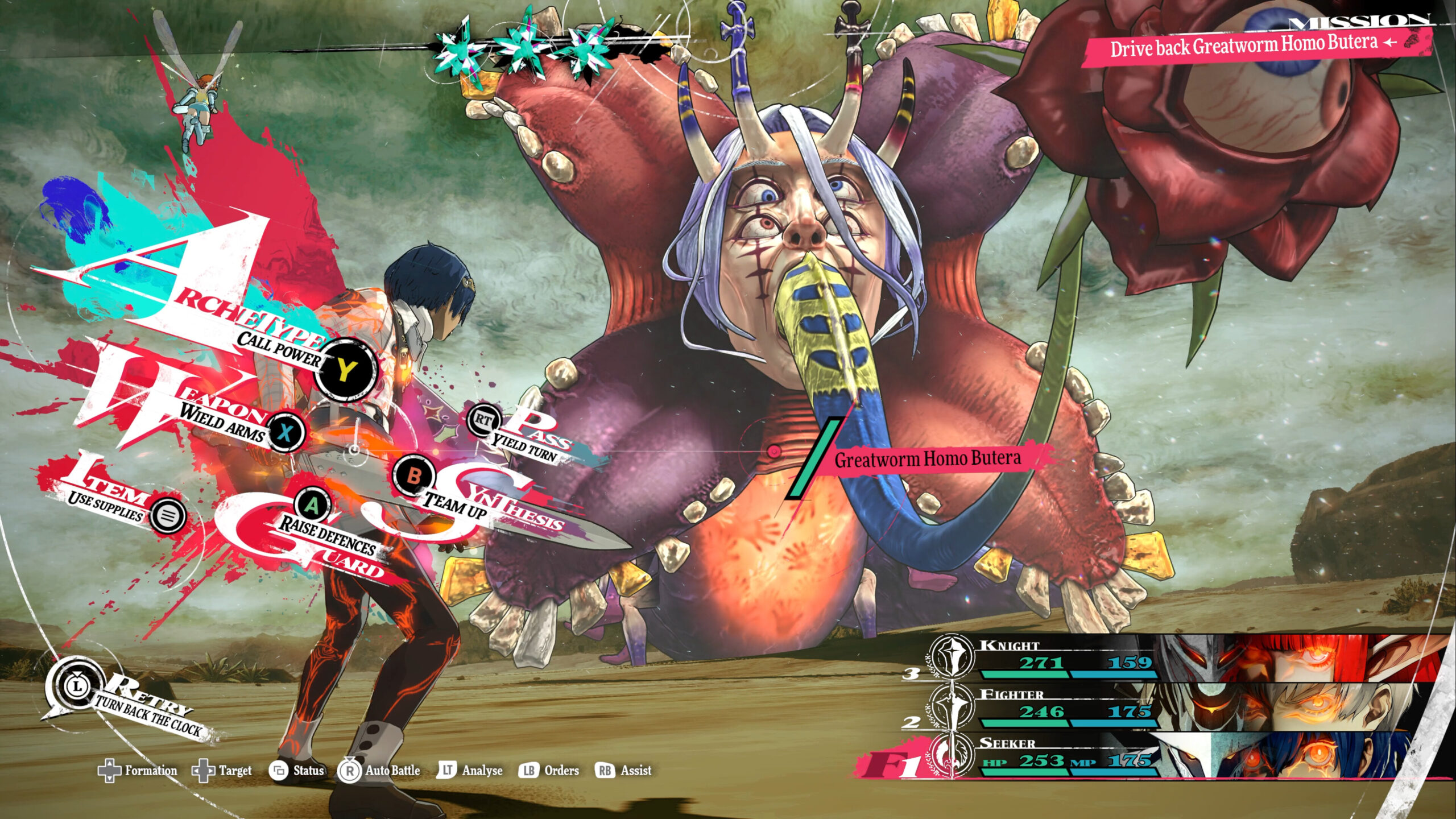
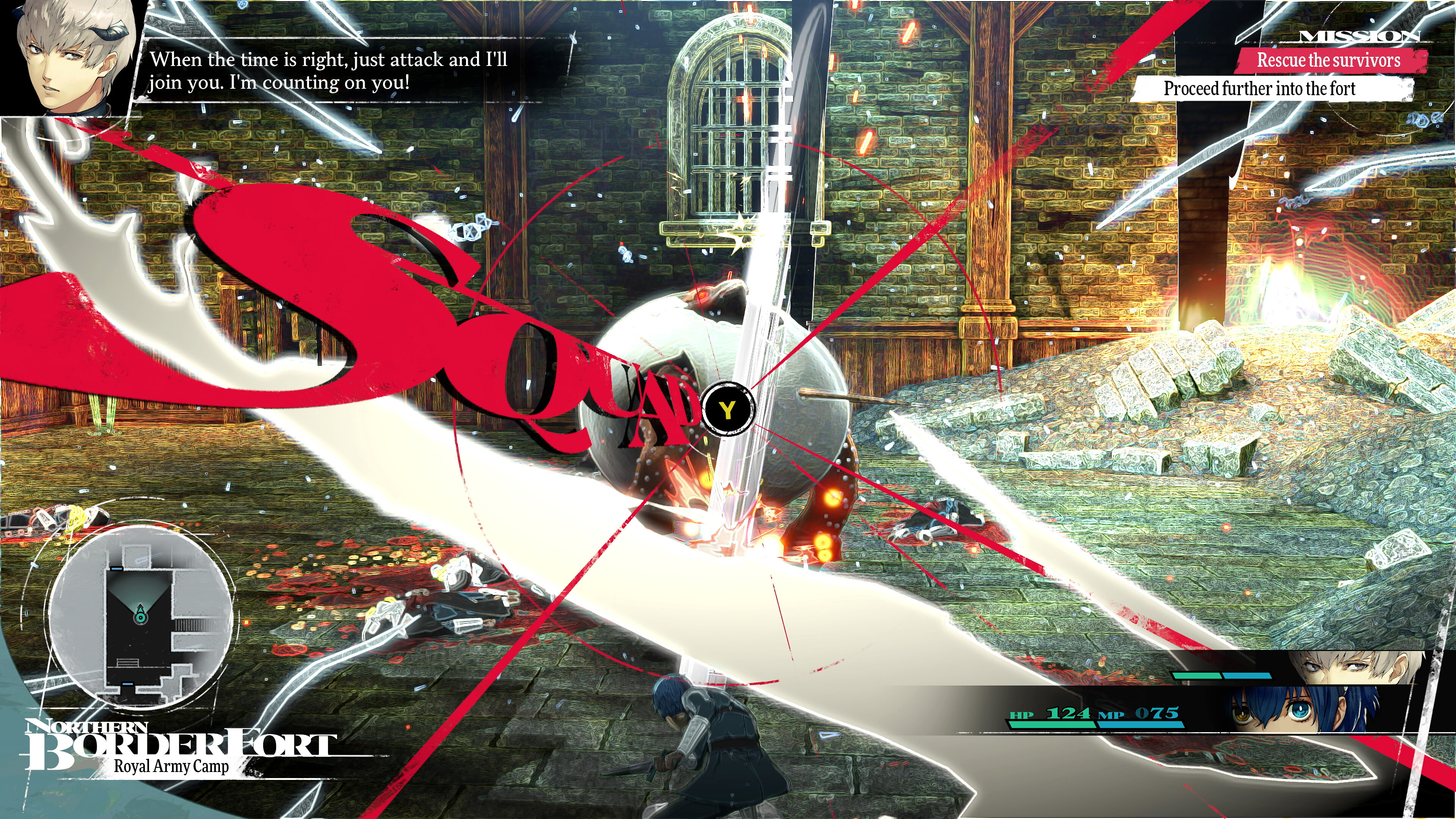
Over the last decade or so Atlus has moved from designing menus with flair to menus with so much flair that they become a key element of engaging with their games’ basic mechanics. “Every button press in Metaphor triggers some kind of gala event,” Joshua wrote. “Something as simple as checking my character stats sparked a sugar rush of Shigenori Soejima artwork as party member portraits twisted across the screen, all of them distinct and gorgeous.”
Metaphor and Persona’s interfaces are (nearly) universally beloved, but there are also some players who struggle with them, and not just as a matter of taste. “I noticed that I start to feel physically uncomfortable looking at it,” wrote Redditor Riivu on the Atlus subreddit last year, in a thread titled “Hypersensitivity issues with Metaphor: ReFantazio menu UI.”
“I’m not gonna say I get anxious, because I don’t think this is quite anxiety(?),” Riivu wrote, “but it simply gives me this deeply uncomfortable physical feeling and I get almost a bit nauseous. I talked about this with a friend of mine who’s on the autism spectrum and he also described feeling uncomfortable with the several constantly moving parts and particles of the menu design, and I have seen maybe one or two randoms talking about this.”
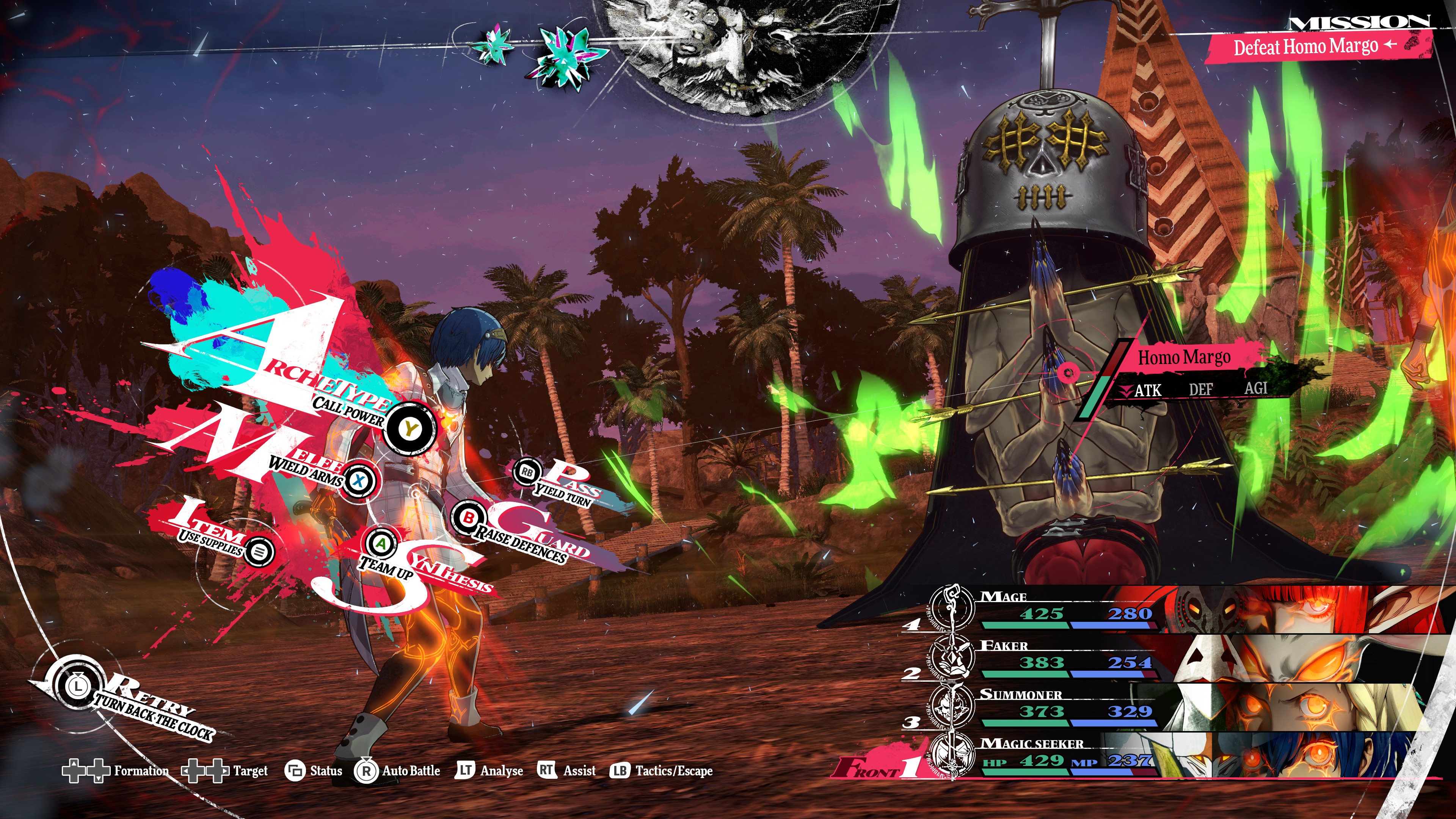
A number of people in the comments echo the same sentiment, citing that it gives them vertigo or the same hard-to-pin-down feeling of discomfort. For those players, liking Metaphor’s UI isn’t just a matter of taste—it’s an accessibility issue.
With that portion of the playerbase in mind, I asked Koje Ise in an interview before his GDC panel whether Atlus has considered adding a stripped-down visual mode that wouldn’t be as overstimulating.
“We do acknowledge that there are certain people with certain needs,” Ise said via a translator. “We understand that there is a need for that, and it’s something we’re considering.”
Since Atlus didn’t design Metaphor from the ground up with that sort of visual accessibility in mind, adding it in now wouldn’t be trivial. “At this point in time, our UI is so embedded and intertwined with the functions of the game, if we are to take that sort of approach we really need to be thorough about how we approach it, and make sure it still works with an accessible design,” Ise said. “At the same time, we do acknowledge that it is something we understand we’ll need to work on and provide in the future.”
With each new RPG, Ise said his team wants “one-up our past work in terms of stylishness,” while at the same time “putting forth something that can only be achieved by that specific game.” In Metaphor’s case, that meant taking into account the characters and setting and how they different from Persona, and “weaving those unique elements into the UI.”
Hopefully Atlus’s next project, whether it’s Persona 6 or something new altogether, will retain that creativity while also making the interface more configurable for players who struggle with the flashy design.