Putting the ‘meh’ in ‘homehscreen’.
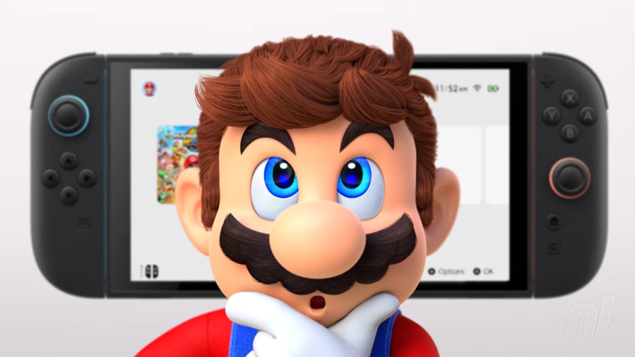
One of the biggest criticisms against the Nintendo Switch is its home screen. There’s nothing wrong with it, per se, but it does lack a certain pizazz that we had come to expect from Nintendo’s consoles. The House of Mario didn’t pull back the curtain on what creative design swings the Switch 2 takes, menu-wise, in today’s Direct, but it has shared an image of it in a recently updated webpage. Sorry folks, it’s still pretty bland.
At an initial glance, you would be forgiven for assuming that the Switch 2 menu is a carbon copy of its predecessor. As seen on the Switch 2 Edition Games page, the menu takes the same white background and grey icon colour scheme as Switch 1, with some small differences in the lower bar — notably, the inclusion of the GameChat ‘C’ button.
Read the full article on nintendolife.com

